Overview
Harman partnered with AT&T to create an interactive demo illustrating the performance differences between 4G and 5G network speeds. The experience was designed for portable kiosks displayed at events and conferences.
My role focused on concept development, wireframing, iterative design, and delivering polished high-fidelity screens in Figma.
The Challenge
AT&T needed a compelling, easy-to-understand way to demonstrate the real-world speed and quality improvements gained with 5G.
Initial concepts lacked visual impact and did not clearly highlight the difference between 4G and 5G performance.
Key challenges we needed to solve:
- Presenting speed test results in a way that is immersive and eye-catching in a busy event environment
- Ensuring clarity around network performance differences
- Designing for small displays where visual hierarchy and readability are critical
- Maintaining brand alignment between Harman and AT&T
Users & Context
The kiosk experience was designed for:
- Event attendees
- Industry partners
- Executives and media
- Potential automotive/tech collaborators
Because kiosks are typically used in high-traffic, high-distraction environments, the UI needed to be:
- Visually bold
- Fast to interpret
- Engaging from a distance
Design Goals
- Make network speed differences instantly visible and easy to understand
- Create an immersive, cinematic experience that captures attention
- Maintain consistency with AT&T and Harman visual design guidelines
- Keep the interface simple, clean, and intuitive for touch interaction
Design Process
1. Sketching & Early Concepts
We began with quick sketches to explore different ways of visualizing speed tests, layouts, and the contrast between 4G and 5G performance.
These sketches helped us rapidly test ideas such as:
- Split-screen comparisons
- Side-by-side video playback
- Animated gauges or meters
- Static vs dynamic UI styles
2. Wireframing in Figma
Next, we moved into low-fidelity wireframes to define:
- Screen layout
- Visual hierarchy
- Interaction flows (for touch-enabled screens)
- Video placement and captioning
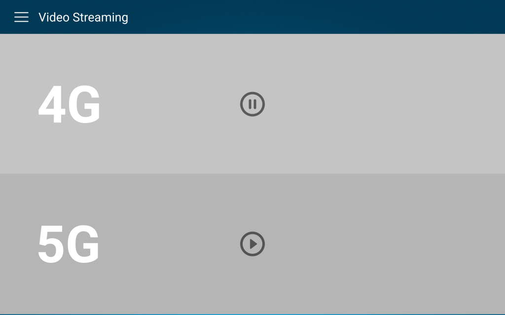
The initial wireframes used smaller video windows for the speed test visuals, framed within the UI.
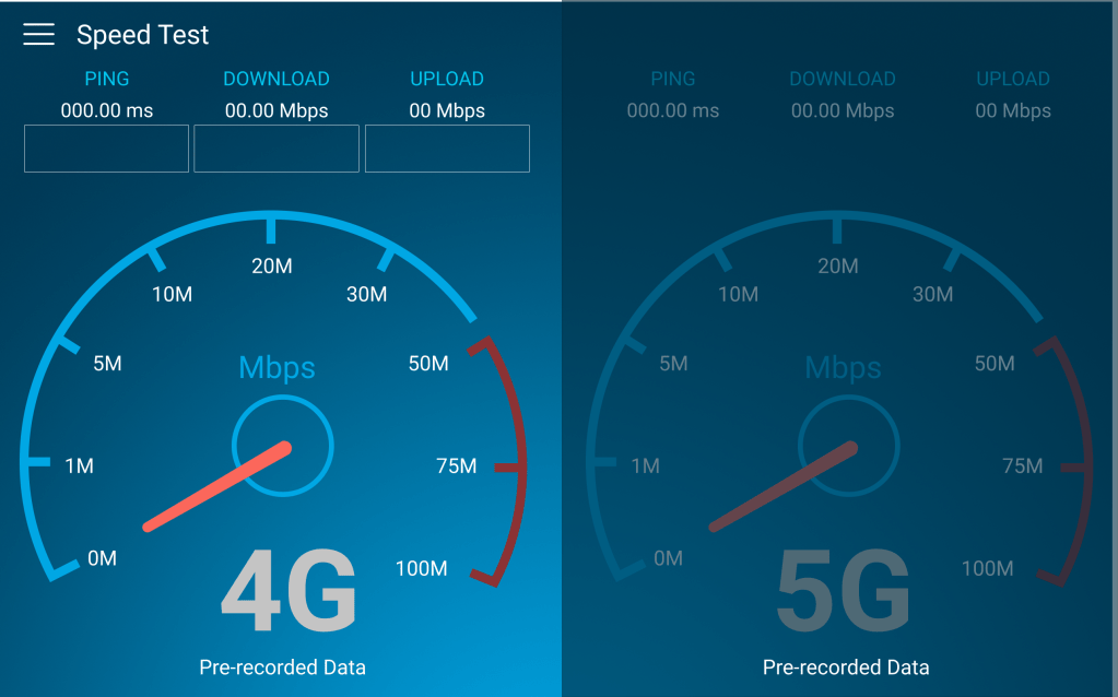
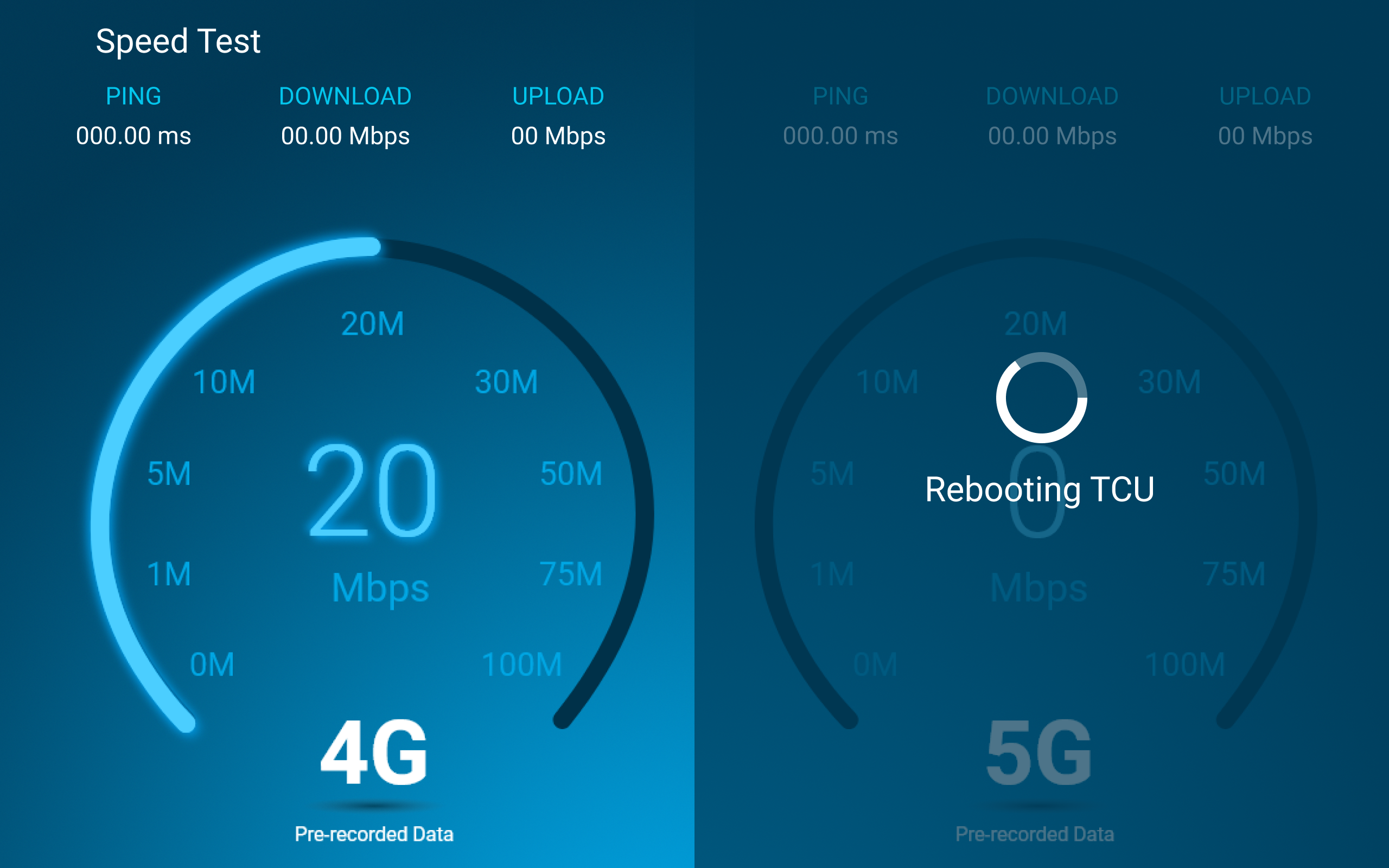
Testing and feedback revealed that this layout felt constrained. Also, feedback for the initial designs for the speedometers were to update them to have a sleeker, more modern appearance.
3. Iteration Based on Feedback
Through internal critiques and stakeholder feedback, several key improvements emerged:
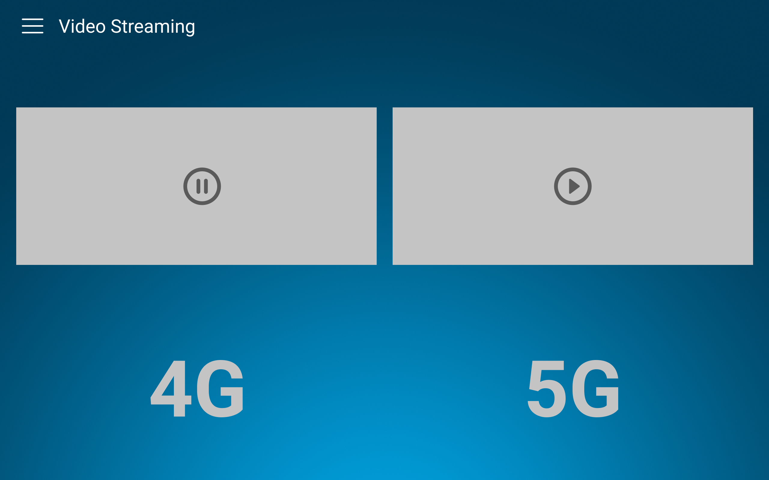
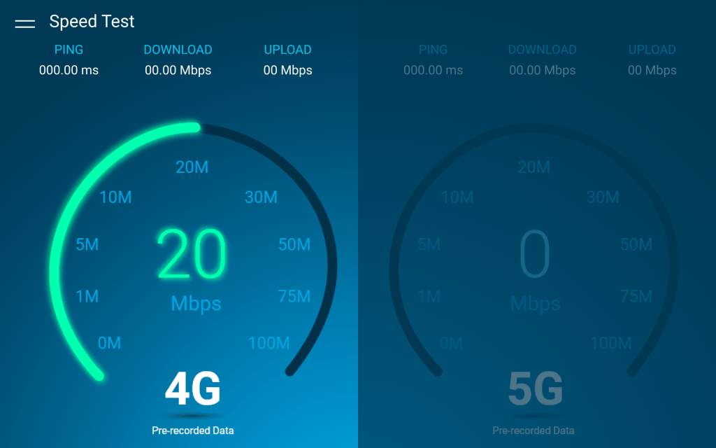
- Full-Screen Video for Immersion: We redesigned the experience so that 4G and 5G test videos play full-screen, creating an immediate, high-impact comparison.
- Color Exploration: Upload vs. Download: We explored assigning different colors for upload vs download speed tests to create clearer differentiation.
However, user observations indicated that multiple colors added unnecessary complexity and distracted from the core comparison.
Final decision:
We kept a consistent blue color scheme, aligned with AT&T branding and easier for kiosk audiences to interpret quickly.

4. High-Fidelity Design
The final screens were created in Figma, incorporating:
- AT&T brand elements
- Motion cues and video placeholders
- Color and typography
- Simplified metrics for at-a-glance comprehension
We ensured the design would scale seamlessly across different kiosk screen sizes.
Key Features
- Full-screen side-by-side speed test videos
- Clear labeling for 4G vs 5G
- Consistent AT&T blue color palette
- Minimal UI chrome to keep user focus on the video content
- Event-friendly, high-impact visuals
Behavior
The kiosk displays the speed tests for upload and download speed and sample videos, allowing attendees to visually compare:
- Page load time
- Download speed
- Upload responsiveness
- Buffering and video quality
The experience communicates the 5G advantage in an easy and immersive way.
Outcome & Impact
The redesigned demo successfully delivered an engaging and intuitive speed comparison that aligned with both Harman’s and AT&T’s expectations for event-ready content.
Results:
- Improved viewer engagement due to immersive, full-screen visuals
- Clearer perception of 5G advantages
- Stronger alignment with brand identity
- Positive feedback from internal stakeholders and event coordinators
The final demo helped AT&T communicate complex network performance concepts in a simple and visually compelling way.
Tools Used
- Figma – Wireframes, prototypes, and final visual design
- Sketching – Early concept exploration
Key Takeaways
- Full-screen video dramatically increased the impact and clarity of the comparison
- Consistent color use improved usability in fast-paced environments
- Iteration based on real-world viewing context (event kiosks) was essential
- Designing for large displays requires exaggerated contrast, bold typography, and simple UI
